Styling The ‘Design Leftovers’
Posted by Andrew Lindstrom / Observational / August 25th, 2008
I never realized it before, but I think that the footer end of a blog post is perhaps the most under appreciated element of web design today.
For the most part, this is where us designers cram all the leftovers we can’t put anywhere else in our layouts into one confined space.
Social bookmarking links and ‘related posts’ lists are the blog designer’s equivalent of yesterday’s over-cooked turkey and dried out mashed potatoes – sitting in your fridge, never to be eaten.
Bad analogies aside, take a second to think of the reader who actually makes it all the way to the end of an article you’ve written…
- They’ve made a conscious decision to read your article
- They’ve actually read said article in its entirety
- Now they are looking at what else you have to offer
This is your dream visitor, do not disappoint them!
So why is it that the majority of blogs out there (including yours truly) hand these prize visitors a plate of cold turkey and let them fend for themselves?
Originally, this article was going to be a list of well-designed blog footers from around the internets. The only problem was after a substantial amount of scouring I could only find two – that’s right – two. Two out of around 50 popular blogs that had a great footer layout for their blog posts.
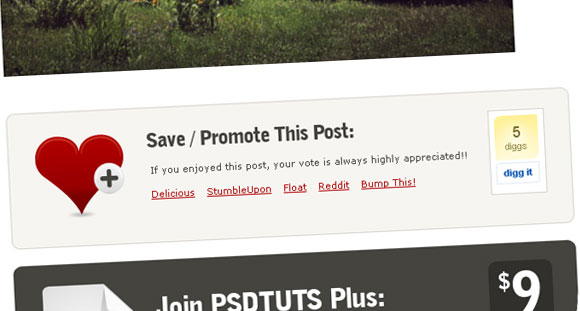
1. PSDTUTS

PSDTUTS keeps it strictly social with a simple yet striking design. And it works. Similar layouts are also used on the other ‘TUTS’ sites to equal success.
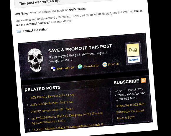
2. GoMediaZine

GoMediaZine really hit the nail on the head. They have social bookmarking, related posts and a variety of RSS subscription options all beautifully laid out in one, well-styled container.
I’m as guilty of neglecting the blog post footer as anybody. At the time being, wellmedicated’s most prized readers are offered a handful of social bookmarking links at the end of every post that in no way stand out from the rest of the layout – in fact, they blend in.
Now if you’ll excuse me, I have to smack my head against my desk repeatedly.
Update: Since posting this article I have listened to my own advice and re-designed my post footers (seen below).

I just found your blog by the 50 Polish film posters post (great post BTW) and one of the first things I noticed about your blog was your GREAT footer! Keep up the great posts 🙂 Loving them!
@Matty – Thanks man! I’ll do my best 🙂
Thanks for the insight. WIth this in mind I think I may give it a whirl myself.